

By Nancy Armitage
Color Theory is one of my favorite subjects! In the 1970’s, at art school (Art Center College of Design in Pasadena, California); I had an amazing color teacher named Judy Crook. She taught us about Goethe’s Color Theory, the Golden Section, Complementary Colors (opposite colors on the color wheel), Simultaneous Contrast, & “Color Stepping”.

Goethe, he wrote: “Zur Farbenlehre, “Goethe’s Theory of Colour” it was written in 1810. He believed that colors affected each other. Especially if certain colors lay side by side, he felt they actually intensify each other. These colors that lay opposite of each other on the color wheel. Like red-green, blue-orange & yellow-purple. He also professed that certain colors had an psychological effect on the human mind. By the late 1800’s, this theory had a huge trickle effect on the fine artists of the world. His psychology of color was greatly influenced by the Impressionist painters like Monet, Pissarro, Renoir, Manet, Seurat, Cezanne, & Van Gogh. Later, Wassily Kandinsky wrote a book about the psychology of color called “Concerning the Spiritual in Art”. Its a long but fascinating book, & I recommend highly. Kandinsky was a inspired abstract artist & a teacher at the great Bauhaus Art School in Germany (1919-1930).
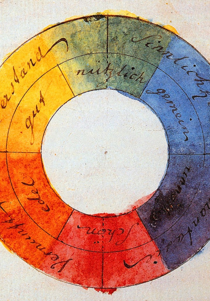
Here’s a little crash course on color theory: Goethe’s Color Wheel was a simple color wheel including the “primary colors” (red, blue, & yellow). The mixture of red, blue & yellow to create the “secondary colors” (orange, green & purple/violet). We were taught at art school that yellow should always be at the top of the color wheel & that purple/violet should be at the bottom. It makes sense, because cool colors would be on one side & warm colors will be on the other side. Easier to understand the color wheel.
Here’s the part where colors affect each other: Goethe determined that there were 3 color systems which are all “complementary colors” (opposites on the color wheel) that intensify each other: Red-Green (Think Red geraniums against green leaves or Christmas colors), Orange-Blue (Think sunsets over ocean/sky), Yellow-Purple (Think Monet & the Impressionist paintings, more pastel in application).
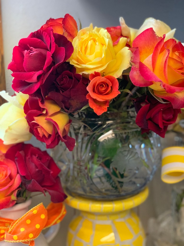
“Color Stepping” (a Judy Crook term) I have never found this phrase in any color theory book I’ve ever read. Judy taught us that Color Stepping has a couple different meanings. First, you can include a group of colors together that are next to each other on the color wheel, like warm colors or cool colors. This is a very pleasing affect on the eye. Like the flowers (above) the warm colors are placed like they are on the color wheel. Color stepping can also be achieved by placing a swatch of red at the top of the paper & green on the bottom; then painting all the colors in between by mixing the red & green together. You will achieve a brown color in between the red & green. Color stepping has a couple other meanings too: It could be one color like green & adding white to achieve all the “tints” of the green hue. Or adding black to the color blue & illustrating all the “shades” of that blue color or hue.
On my color wheel (below), I also added the colors in between the primary & secondary colors. I like to add these mixtures of their neighbor color: red-orange, orange-yellow, yellow- green, green-blue, blue-purple & purple-red. One can see the warm colors on the left & the cool colors on the right.


Goethe’s Color Theory’s bottom line was that color & those colors that surround it, affect each other. As a artist-painter, decorator, or designer, we use complementary colors (opposite of the color wheel) to “pop” our subject whether its a room, a painting, or a poster design. This pop of color or interesting color combination creates interest in design.
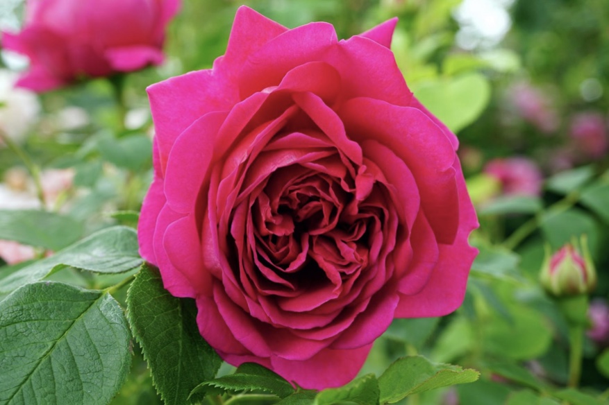
So red & green are opposites of the color wheel (this also includes pink). When you put these colors side by side they make each other more intense, even a “flicker” effect appears in between the colors. Check out the hot pink against the lime green at the top-right of the rose. This “flicker” effect is called “Simultaneous contrast”. Important: This color technique only works, if the colors are at the same value (intense pure color against intense pure color or pastel against pastel opposites.)
Color in the Garden:
So now I’m going to confuse you, sometimes “simultaneous contrast” opposite colors can work with the color next to the opposite color – so red & green are opposites: Complementary colors. But the bright red & the bright light blue (next to green on the color wheel) are also creating “Simultaneous contrast” too (below). That “flicker” is really happening on the right where you can see the red rose over the bright light blue tablecloth.

.

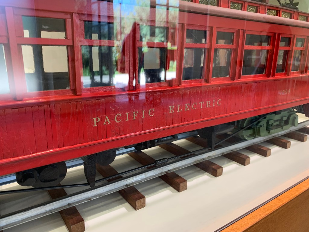
Mr. Henry E. Huntington & his “Red Cars”:
Mr. Henry E. Huntington was not scared of color, in Los Angeles in the early 1900’s he painted all his trains bright red! Those trains traveled throughout the Los Angeles & Orange Counties down to Newport Beach & out to Redondo Beach, CA . His Pacific Electric Co. train cars were called by the locals, “Red Cars”. Can you imagine early in 1900s, his bright red trains cruising over bright green grass fields after a rain storm? It would have been a amazing sight to see.
Mrs. Huntington & her interior design changed:
Mrs. Arabella Huntington was not frightened of color at all; she used color to her advantage in the decorating all her mansions & French Chateau Beauregard in Paris. In 1880’s to 1920’s, red was a symbol of wealth & status. In her New York mansions, she used a lot of bright red with red flocked wallpaper, red velvet drapes, & red upholstered brocade chairs with gold, etc. Mrs. Huntington was also emulating English and French royalty. It was the Gilded Age in New York City, & it was “over the top” decor. But at the San Marino Ranch, Mrs. Arabella Huntington changed her style of decorating, it was much more reserved. It seems she used red only to pop the design of a room, not to overwhelm the viewer with too much red. At the Huntington’s Ranch, it was demonstrated in the Mansion Inventory. In Mr. Huntington’s Sitting-Room upstairs, she used these colors: red. black, & gold. She used red as a pop of color with 2 damask red chairs & red pillows on a striped sofa & red in her oriental rug.

Mrs. Arabella Huntington as interior designer:
In the Huntington Mansion inventory (San Marino Ranch), Mrs. Arabella Huntington had a very artistic eye with all her beautiful French & English antiques & decorations. Mrs. Huntington was the interior designer for all her mansions; but Joseph Duveen helped the Huntingtons decorate the San Marino Ranch Mansion. There were alot of Huntington Mansions:, No. 2 57th St. NYC, Huntington “Homestead” estate Throgg Neck in Westchester Co. NYC, Chateau Beauregard., Mrs. Huntington owned 2 mansions in Paris: one of rue Gabriel / l’Elysee (Hotel Hirsch) & one of Lubeck, San Marino Ranch, Camp Pine Knot in the Adirondack Mts., Lexington Ave. & 54th St. in NYC. This was her task as a wife of very powerful & wealthy men; she did it well for her Huntington husbands, Collis P. Huntington & Henry E. Huntington. Over the years, she listened to designers & artisans, but she was always quite influenced by French interior design.
At the Huntington’s Ranch, something changed with the interior design of the Huntington Mansion. Someone determined that all the walls should be white. It could have been the architect, Myron Hunt. Or, Mr. Henry E. Huntington stating that the building would become a museum after he passed away. Could it have Duveen or Mrs. Huntington? So I found out who it was…. On March 12, 1901, [1910], H. E. Huntington wrote a letter to Hunt & Grey (his architectural firm) & stated “The 2 Drawing Rooms are to be finished in white & grey not (Hunt & Grey) & the Dining Room about the same”. Mr. Huntington even made a little joke! The Huntington Mansion had a much more sophisticated look to it; more subtle in its application of color or lack of color with 90% white walls. The use of white walls were inspired by Versailles Palace with the French color: “Blanc du roi” (meaning the King’s White) they also mentioned it was a warm white. Nancy Note: the date on letter it is incorrect Mr. Huntington didn’t even buy the San Marino Ranch property until 1902. The date of the letter, should be 1910, not 1901; Myron Hunt built the Huntington Mansion for 1908 to 1910. In May of 1910, Mr. Henry E. Huntington (divorced from his 1st wife, MaryAlice Huntington). He moved into his San Marino Ranch – Huntington Mansion with a small servant staff. He brought with him, a housekeeper (at first, Mrs. Foley & then Miss Nora Larsen), cook, laundress (Mrs. Stringer), gatekeeper (Mrs. Muller), chauffeur (Mr. Barnett), & a night watchmen (L.H. Larson). Information for white walls was in Book: Art of Wealth by Bennett.

At the San Marino Ranch mansion, Sir Joseph Duveen teaches Mrs. Arabella Huntington to use color in a more delicate way. Using red to “pop” a room instead of the red taking over the design of the room. They were influenced by French design; using beautiful rich red & gold, gold & black damask & brocade textured fabrics on couches & chairs. Which were all chic French color design combination. In Mr. Huntington’s “Sitting Room” upstairs, they used red, gold, & black (A French color influence) with black & gold couch with red chairs as the “pop” of color. These damask/brocade fabrics were her favorite; they had bolts of hundreds of yards of these elegant fabrics (red, blue, & green, & gold) in the Huntington’s closets. Instead of using red to decorate the whole room like the White House, the “Red Room” & “the Blue Room” she is much more restrained at the Huntington Mansion.
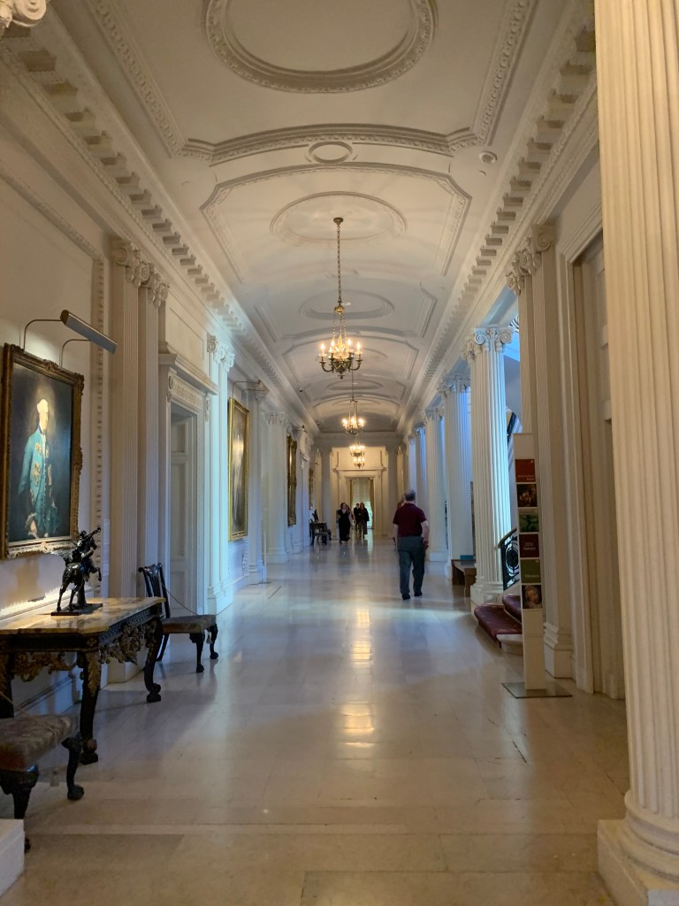
The Huntington Mansion at the Ranch, the large rooms were mostly white except for the Large Library & the Small Library (Mr. H.E. Huntington’s office) which were beautiful wood, wood borders, wood cabinets for his beloved books, & carved walnut wood with inlaid parquet wood floors.

On these Huntington mansion’s white walls, with ornate plasterwork carved borders something happen magically to their paintings. These borders enhanced all the master paintings that the Huntingtons collected. The borders helped to draw the eye right to the treasure. The Huntingtons also had great lighting above each painting to further enhance the experience & see color and texture. An interesting fact I discovered from Huntington Mansion inventory book: Only the Huntington’s valuable oil paintings were located downstairs. Vs. the watercolors, etchings, drawings, pastel paintings, & high quality hand-colored prints were all located upstairs. This was the sign of the times.
In the 1920’s, the Huntingtons owned some lovely Mary Cassatt pastels, all located upstairs. I love Mary Cassatt paintings & she was favored as a great artist! Even Degas jealously thought Cassatt was a great artist. With all the watercolors & pastels being banished to the upstairs. It was more about the likes of the London’s Royal Academy & their art standards at the time. Oil paintings were considered valuable & watercolor paintings were not.
Often, these little jewels (pastels, watercolors, & drawings of Huntington Library Collections are on display to be seen to the public. The curators treat us to these pieces in a small gallery (upstairs) by the south-west corner of the mansion. Watch for them, they usually are amazing little art shows like Macintosh art & crafts drawings, or Blake’s watercolors, or writings.
Red at the Huntington Mansion (SMR): Red had a prominence in the Huntington Mansion, for sure. Several rooms at the mansion are devoted to the color red & having “pops” of red in them. These rooms were Mr. Huntington’s Upstairs Sitting Room, the Coat Room, Archer’s Room upstairs, Guest Cottage Large Hall, the Bowling Alley, & Billiards Room, even Mr. Huntington Office or small Library . Maybe this addition to red was a nod to Mr. H.E. Huntington’s very successful LA train system his “Red Cars”: Pacific Electric Railway Co.
Red in the H. E. Huntington Guest Cottage: We now know the Huntington’s Guest Cottage was actually a very large structure, not a cottage at all. It was designed by Architect, Myron Hunt, like a mini White House. It had a traditional flair with 4 white large column pillars in front. A Southern antebellum look & feel with a large veranda used for entertaining. It also had a half moon driveway with green grass in front. Arabella was a southern belle, she must have loved this structure that would have reminded her of Alabama, Richmond Virginia & West Virginia where she had once lived. The cottage was intended for her son, Archer Huntington; so Mrs. Huntington decorated it in a Spanish style just for him. Archer was obsessed with Spanish culture, he was the founder of the Hispanic Society of American in NYC. A elegant style that is now called “California Rancho” enhanced with red, indeed. It had oriental red carpets , red iron sconces, red couches, & Spanish carved chairs upholstered in red brocade silk fabric with gold.
In “Mr. Huntington’s Sitting Room” upstairs on the 2nd floor of the Mansion, was an inviting personal room. Mrs. Huntington used red for that pop of color to make a statement. This room had a modern French look in style; decorated in black & gold with a pop of red. There was a striped gold & black couch with gold & black cushions. She also hung 3 pairs of French “cretonne curtains” on the windows. In the 1920’s, cretonne curtains were “Art Nouveau” style with large ornate French floral prints like red, white, beige, & sage green. Red-green opposite of the color wheel. For the red pop, she also had 2 mahogany chairs upholstered with red damask 2-tone fabric.
Mr. Henry “Edwards” Huntington was surrounded by his favorite things. Mr. Huntington’s Upstairs Sitting-Room was located just next to the Huntington’s Small Bird Aviary (Mint green floors) on the southern side of the mansion. The room was also used as a “Reading Room” with lots of books (113 books in a Adams Satinwood Bookcase), a Tea Table for afternoon tea, or maybe a morning “breakfast tray” with coffee. Mr. Huntington’s Sitting Room also had a Japanese card table for playing cards or other games. It had many personal items of Mr. Huntington’s like family portraits & sculptures filled the room. “Mr. Henry E. Huntington” portrait by Oswald, a portrait of HEH’s mother & his father, both painted by Seymour Thomas, & several prints of women. In this Sitting Room was also a plaster model of Mrs. Arabella D. Huntington by Paul Troubetzkoy created in 1917; now that sculpture we have located at Mariners Museum, Newport News, VA .
Mrs. Arabella Huntington also used artwork also for a little pop of red color. The art in Mr. Huntington’s Sitting Room was “Portrait of women” by F. Cotes dated 1751 & a oil painting, “the Adobe Flores” by Norman Stiles Chamberlain. The “Adobe Flores” painting was painted in 1923. The painting looks like the “Old Mill” or a California Mission with Spanish terracotta tile roof & patio; with a women sitting in a rancho courtyard. This painting would have reminded Mr. Huntington of his dear ranch in the early days. For another pop of red in the HEH’s Sitting-Room: there was a pastel painting called “Child & Cherries” by J. Russell on the Huntington Mansion’s inventory book. It is a sweet portrait painting of a young girl holding a white basket of red cherries. She wears a white dress with a light blue sash & she is holding up a couple of cherries in the air with her other hand. As if to ask the painter, “Would you like some cherries?” On the bottom of the gold frame, a gold plaque identifies the pastel as “L’enfant aus ceries” by John Russell. This painting/pastel was probably purchased by the Huntingtons one summer when they stayed at their Chateau de Beauregard by Paris or it was acquired by art dealer, Joseph Duveen. This prized pastel is now located at the Louvre Museum in Paris, France.
How did this pastel get to the Louvre Museum? I don’t know. But, Archer Huntington’s life’s work was donating thousands & thousands of valuable Huntington objects & paintings to museums. This is another clue that Archer Huntington just might have come to the San Marino Ranch after all. He might have come to Arabella’s final funeral in December of 1924. He had to settled the “Old Mill” which he inherited from his mother; plus take Arabella Huntington’s items or paintings belonging to him. In the Huntington Mansion inventory, a room in the mansion is identified as “Archer’s Bedroom”; also there are photographs at the Huntington Library archives of Anna Huntington (Archer’s 2nd wife) at the San Marino Ranch; those photos are labeled 1924. Document: HEH Coll HEH 38/6 uncat [Huntington Mansion’s brown inventory book] Huntington Library San Marino, CA
Mr. H.E. Huntington’s Small Library (Office) : Mr. Huntington’s Small Library had a lot of red, probably a nod to his famous company Pacific Electric or PE, “Red Cars”. It had one of the oldest antiquities in the Mansion: German needlework tapestry (1500’s- 16th Century) over the fireplace with a beautiful red “Kermanshah (Persian) silk rug with colors of red, green, & crimson. A red leather chair behind Mr. Henry Huntington’s desk, 2 tapestry chairs, a Tiffany lamp, & two pairs red satin curtains.
Even the Coat Room at the entrance of Huntington Mansion had a touch of red with a red oriental rug, & 1 pair of red satin curtains. This room once housed one of my favorite art pieces of the Huntington Library. It is a stunning French Bronze relief, of a Mother nursing her baby by Alexandre Charpentier. This piece now hangs in a staircase to the Reference Library (Huntington Library Building), probably offensive to the general public. So it was sadly moved out of the Huntington Mansion, but I find it such a amazing moving piece of art. The room also had a Spanish walnut table with gilded base 36″ x 30″. It had two gilded mirrors & a Chinese Chippendale long table.
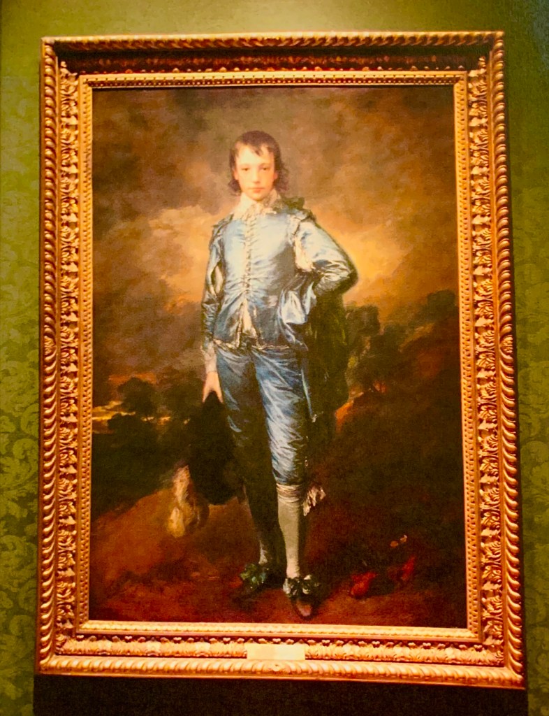
Blue at the Huntington Mansion (SMR): In the Huntington’s “Large Drawing Room” was a blue room with the famous painting, “The Blue Boy” by Gainsborough. The painting was in a large gold frame on a white wall. Like a gallery wall to enhance the paintings that the Huntingtons treasured. There were other items in this room to enhance the blues. There were 2 (3 -light) candelabras (Blue & Gold) bronze on the mantle, & 3 sets of satin brocade curtains of blue, grey, with gold. There were many other paintings in this room, several more paintings by Gainsborough: “Cottage Door”, “Anne, Duchess of Cumberland”, Hon. Mrs. Henry Fane”, & Hon. Lavinia Burgham [Countess Spencer], The “Fortune Tellers” by Reynolds, “Marriage of the Adriatic” by J.M.W. Turner (also called The Grand Canal scene a street in Venice), “Pinkie” (Sarah Goodin Barrett Moulton) by Lawrence acquired later by HEH in 1927. Document: HEH Coll HEH 38/6 uncat [Huntington Mansion brown inventory book)

Green at the Huntington Mansion: The Dining Room: was surrounded by 8 different famous Romney paintings; the dining room colors were green & gold. Mrs. Huntington decorated the Dining Room in a rich sap green color. Which is brilliant because green matches every season: Spring, Summer, Autumn, & Winter. As a hostess this is important, that the plateware doesn’t clash with the surrounding room. Mrs. Huntington usually had 12 luncheon or dinner guests. In the 1920’s having a even number at your dining table was proper. The Huntington’s 12 Dining Room chairs were upholstered with a rich two-tone velvet green. The color green matches not only every season of the year, but is perfect for a ever changing (themed) luncheon & dining “entertainments”. Matching all Mrs. Huntington numerous French, English, & American Plateware. They had 2 large side table made of green marble mottled top side table, & 3 sets of windows drapes of green satin (Italian Damask fabric).
Several of Mrs. Huntington’s plateware set were green, she had a affection for Green Transferware, also. At the Huntington Mansion at the Ranch, I found that Mrs. Huntington also had a Haviland green & gold set of plates, also. Purchased in 1914, this pattern was called “Schleiger 341 by Haviland”, simple & elegant, (illustrated below). These plates had a scalloped & gold encrusted beaded edge. With a sage green sprays of leaves with casa blanca white lily flowers (close-up). Also, a little green spray medallion in the middle of the plate. These plates would have gone with any season. Mrs. Huntington could add her Venetian gold wine & water glasses & any color flowers for the occasion. On a white damask table cloth, this plateware would have been stunning. She also used many of her gold & white plateware like Copeland & Garrett, Limoges, or Haviland “Marquis” white and gold plates.

Many of Mrs. Huntington’s Haviland plateware patterns, were gold, green, with pink roses. Her Wheildonware “Pheasant” pattern had green with pink & orange flowers with blue & green bird in the middle. The Whieldenware Pink Pheasant had a bright band of hot pink on the rim of the plate (illustrated below).

Her “Pink Pheasant “Wheildonware (bottom one) tea ware had a large ban of pink had lots of green leaves with a yellow & blue bird in the middle of the plate. Document: HEH Coll HEH 38/6 uncat [Huntington Mansion brown inventory book]

Pink & Green (Paris & French influence at the Huntington Mansion): Remember Mrs. Huntington was a Southern Belle, a pearl girl, & a pink girl, too!! She loved pink especially in her elegant plateware & her pink roses. Her “Old Paris” plateware, there is evidence it was pink & green. Many of her Haviland plateware had a mixture of pink & green in them. Which those two colors, green & pink enhance each other, opposite of the color wheel. A lovely French Color combination is light pink, hot pink, & lime green.

Easter & Springtime would have been a wonderful season to show off the pink & yellow with green roses & other colorful flowers at the San Marino Ranch. The Huntingtons (Belle & Edwards) often spent Easter Sunday at the Ranch & at Hotel Huntington in Pasadena, CA. Surrounded by the Howard Huntington family & H. E. Huntington’s grandchildren. How intense was the color at the Huntington’s Easter Sunday table? It depends on the tablecloth she used & the flowers that decorated the table & the Easter plateware she used. Mrs. Huntington did enjoy pink & white roses flower arrangements & other flowers to decorate her home.

What color pink did Mrs. Huntington’s decorate with? Or her tablescapes, probably not as intense of this picture (above) but we only have black & white photographs to go by. We get hints about her pinks by knowing what plateware that she used. She had Whieldenware Pink Pheasant, bright pink Sevres Tea plates (Below), all her numerous Haviland pink plateware, & several pink patterns in Homer Laughlin “Angelus Rose” plateware. There are alot of pinks, Hot pink, coral pink, salmon pink, Bridal pink, or Light “Cecil Brunner rose” pin.

Color Theory & the Huntington Library:
There was a curated show a couple years back called “Beautiful Science: Ideas that changed the world”. This exhibition showcased the history of color dictionaries, with paint samples & swatches for scientists. The Huntington Library has an amazing collection of color theory books including some of these color dictionaries.
“Color Instruction” by Louis Prang, Mary Dana Hicks & John S. Clark printed in 1893.
“Color Instruction” a measured color system by A.H. Munsell Boston (1909 & 1919 printed); famous for his Munsell Color System of properties of color: hue (basic color), Chroma (color intensity), & value (lightness). Munsell color systems is the base used in most art schools to teach color theory.
“A Class Book of color, color definitions, color scaling” by Mark M. Maycock Springfield Mass. The Milton Bradley Co. in 1896
“Color Value” by C. R. Clifford published by Clifford & Lawton Union Sq. W. NY in 1907 (book includes Color Study, Color Psychology, & Proportion)
“The laws of harmonious colouring, adapted to interior decorations manu. & other useful ” by (David Ramsey) D.R. Hay Published in Edinburgh, Scotland in 1836.
“The Theory of colouring & arrangement of colours” by J. Bacon published by Geo. Rowney & Co. London, 1866; Book includes principles of design: composition, chiaroscuro, art techniques, harmony, color study, & teaching, & contrast.
“The Principles of harmony & contrast of colours & their application to the arts” by M. E. Chereul published by London: Henry G. Bohn Covent Garden in 1860
“Lessons on colour” Color as a means of art by Frank Howard, published 1841 London: Jos Thomas
“Color in the flower garden” by Gertrude Jekyll published in 1908, London Country Life Ltd.
“Color & Meaning” by John Cage, Berkeley, University of California Press, 1999
They also have a Letter of Mr. Issac Newton’s (professor at the Mathematick’s in the University of Cambridge London; printer to Royal Society, dated 1671. Document: huntington.org website, en.m.wikipedia.org (Munsells color system)

Documents:
Document: HEH Coll. HEH 38/6 [Huntington Mansion Inventory brown book]; Document HEH Coll. MS 10968 (Burke Journal- Mrs. Siddons hanging in the main hallway on March 22, 1922); Document HEH Coll. MS 1/F/17 uncat (Huntington Land & Improvement Co.) HEH Coll. MS 4/1-10 uncat (Mr. H. E. Huntingtons Bill Record) 1910 at Huntington Library, San Marino, CA
Art History News Information on Pastel with “Girl with Cherries” also called “Petite Fille aux Cerises” by J. Russell. It was painted by John Russell (English 18th Century artist) & this piece is located at the Louvre in Paris. http://www.arthistorynews.com
Book: The Art of Wealth by Bennett [March 12, 1901 letter from HEH to Hunt & Grey about the color of the walls of Huntington Mansion, San Marino Ranch] Nancy Note: Letter is probably is the incorrect date, it should be 1910, just before Mr. H. E. Huntington moved into the Huntington Mansion.
Book: Waddesdon Manor: Architecture & Paneling London Phillip Wilson 1966 p. 136-206 [Defined “blanc du roi” (the King’s white)
Great books to read on Color Theory:
Book: The Creative Power of Color by Booze Hamburgents
Book: Individuality of Color by Elisabeth Wagner-Koch & Gerard Wagner
Book: Color Perceptions in Art by Brien
Book: Theories of Color by Johanne Wolfgang von Goethe
Book the Art of Color by Itten
Book: Homage to a Square by Albers
Book: The Color Dictionary of Color by Sean Adams

Wonderful post! Thank you!
LikeLike
Thanks so much. Nancy
LikeLike